How Neutrals and Greens Support Wellbeing at Home and Work - 2026 Color Trends

Farrow & Ball Color of the Year
Each January, “Color of the Year” announcements arrive like a mood board for our collective psyche. For 2026, the leading color authorities are leaning into calm: soft whites, grounded greens, and nuanced, complex neutrals. Together, they mirror what many people are craving in their homes and workplaces; spaces that feel restorative, stable, and quietly expressive.
While color psychology isn’t magic, research consistently shows that color can influence mood, perceived stress, and even physiological responses such as heart rate and arousal. Calming palettes - especially soft neutrals, greens, and blues - are repeatedly associated with tranquility, focus, and a sense of safety in interior environments.
Here’s a brand-by-brand look at the 2026 Colors of the Year, what they feel like in a room, and how you might use them to support mental and physical well-being—at home or at work.
Pantone: Cloud Dancer 11-4201
Mood: Quiet clarity, mental “reset,” soft daylight
Pantone’s 2026 Color of the Year, Cloud Dancer (11-4201), is described as a “lofty white neutral” that acts as a whisper of calm and peace in a noisy world. Pantone emphasizes its “billowy” serenity, inviting relaxation, reflection, and creative focus.
In a home or office, Cloud Dancer functions as a weightless envelope—a soft, breathable white that avoids the harshness of cool gallery white. It supports:
Mental clarity & focus: Light neutrals reduce visual noise and can help the brain process information more easily, which is especially helpful in home offices and creative workspaces. ArchiVinci
Reduced overstimulation: For sensitive individuals, a gentle white like this can feel less glaring than stark white, especially when paired with matte finishes and layered textures.
Where to use it:
Whole-house walls in wellness-minded homes
Entryways and hallways that should feel airy and uplifting
Studios and open offices where you want flexibility for art, textiles, or biophilic elements to take center stage
See the color:
Pantone Color of the Year 2026 – Cloud Dancer: Pantone link here.
C2 Color of the Year
C2: Epernay 639
Mood: Hand-crafted calm, soft sophistication, “slow living”
C2’s Color of the Year 2026, Epernay (639), is a champagne-toned neutral inspired by French limestone and hand-crafted materials. The brand frames it as a refined, artisanal hue that celebrates craft and nature. C2 Paint
Emotionally, Epernay sits between warm white and beige. In a room, it can:
Promote relaxation and safety: Warm neutrals are often perceived as more welcoming and less clinical than cool grays, which can support feelings of comfort and belonging.
Encourage grounded creativity: Its subtle warmth pairs beautifully with wood, stone, and natural textiles, reinforcing a sense of connection to the hand-made and the natural world.
Best uses:
Living and dining rooms in wellness-oriented homes
Hospitality spaces, senior-living lounges, or co-working areas that want “quiet luxury” without feeling stiff
Walls in therapy or coaching offices where trust and safety matter
See the color:
C2 Color of the Year 2026 – Epernay 639:
Sherwin-Williams color of the year
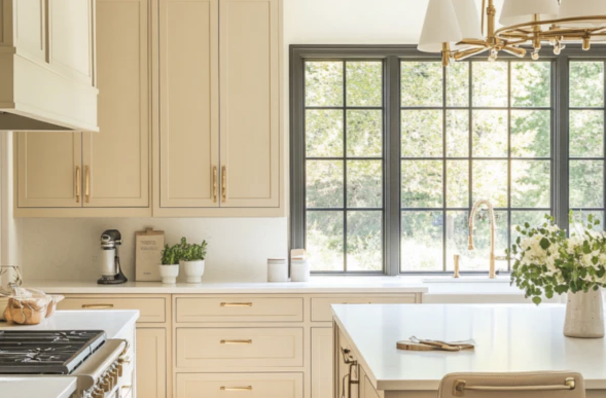
Sherwin-Williams: Universal Khaki SW 6150
Mood: Tailored, stable, reassuring
Sherwin-Williams chose Universal Khaki (SW 6150) as its 2026 Color of the Year, calling it a “tailored and timeless” mid-tone neutral with a slight yellow undertone. It’s framed as an “easygoing neutral that makes every room feel pulled together,” balancing livability and longevity. Sherwin-Williams
From a wellness perspective, Universal Khaki:
Supports emotional stability: The warm, earthy undertone reads as dependable and grounded—useful in spaces where you want to calm anxiety and support routine (kitchens, family rooms, waiting rooms).
Helps regulate visual load: A mid-tone neutral can be easier on the eyes than very dark or very bright spaces, supporting visual comfort in offices or learning environments.
Best uses:
Open-plan living/kitchen areas with lots of daily activity
Workplace corridors, private offices, or meeting rooms that need to feel professional yet warm
Multi-generational homes where the palette must appeal across ages
See the color:
Behr Color of the Year
Behr: Hidden Gem (N430-6A)
Mood: Restorative, energizing calm, jewel-box focus
Behr’s 2026 Color of the Year, Hidden Gem (N430-6A), is a smoky jade green described as a “moody yet uplifting” jewel tone that brings depth and sophistication. Design coverage highlights its ability to be both invigorating and calming—especially when paired with warm woods and soft whites. Southern Living
Green is one of the most consistently calming hues in environmental psychology studies, associated with reduced stress and mental fatigue and improved focus. Hidden Gem, being deeper and more saturated, can:
Create a cocooning, spa-like effect in bedrooms, reading nooks, or wellness rooms.
Support focused work when used strategically on an accent wall in offices or studios—especially behind a desk or in a meeting space to reduce visual clutter in your field of view.
Best uses:
Accent walls in home offices and Zoom backdrops that signal calm confidence
Powder rooms, meditation corners, or moody dining rooms
Retail or hospitality spaces wanting a rich, “boutique” vibe without harsh contrast
See the color:
Behr 2026 Color of the Year – Hidden Gem:
Ben Moore Color of the Year
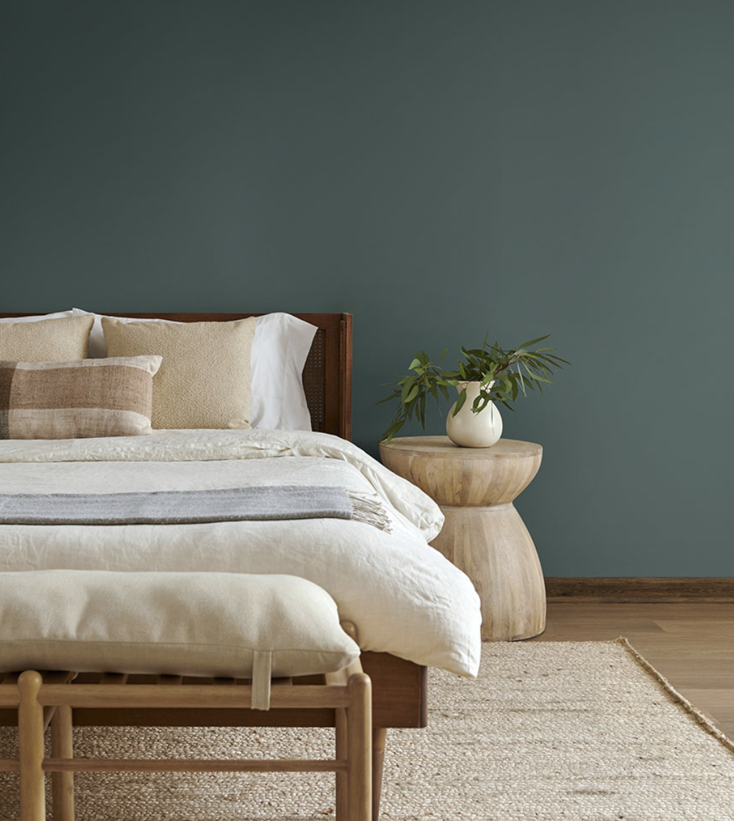
Benjamin Moore: Silhouette AF-655
Mood: Cozy sophistication, introspection, emotional depth
Benjamin Moore’s Silhouette (AF-655) is a deep, chocolate-brown with charcoal undertones, selected as its Color of the Year 2026. The brand describes it as “refined elegance,” blending burnt umber with charcoal for a luxurious yet livable depth. Benjamin Moore
Color research suggests darker, enveloping hues can feel protective and cocooning when used thoughtfully—especially with sufficient lighting and contrast. Silhouette in particular can:
Promote introspection and grounding: Ideal for spaces where you want to feel held and contained, such as reading rooms, dens, or therapy offices.
Create a sense of luxury and security: Deep browns are often linked emotionally to wood, earth, and leather—materials tied to warmth and stability.
Wellness tips:
Balance Silhouette with warm white trim, soft textiles, and layered lighting to avoid a heavy or oppressive effect.
In workplaces, use it on a feature wall rather than all four walls to maintain alertness.
See the color:
Benjamin Moore Color of the Year 2026 – Silhouette AF-655:
Dunn-Edwards Color of the Year
Dunn-Edwards: Midnight Garden DE5657
Mood: Night-garden quiet, serene focus, biophilic depth
Dunn-Edwards selected Midnight Garden (DE5657) as its 2026 Color of the Year, describing it as a deep, muted green with earthy undertones that captures “the tranquility of a lush garden under the moonlight.” It’s positioned as a timeless color that “invites us to slow down, take a deep breath, and appreciate the spaces we call home”. Source: Dunn-Edwards Paints
This kind of deep, nature-inspired green can:
Strengthen biophilic connections: Deep greens remind us of forest canopies and foliage, which can reduce perceived stress and support feelings of restoration.
Enhance focus: Darker, low-chroma colors on peripheral walls can be less visually distracting, supporting concentration in work or study settings.
Best uses:
Kitchen or library cabinetry paired with warm metals and natural woods
Feature walls in yoga studios, spa lounges, or quiet lounges in senior living communities
Exterior doors or shutters to anchor a wellness-oriented façade
See the color:
Dunn-Edwards 2026 Color of the Year – Midnight Garden (DE5657):
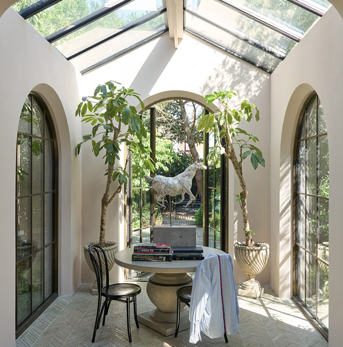
Farrow & Ball Color Trend
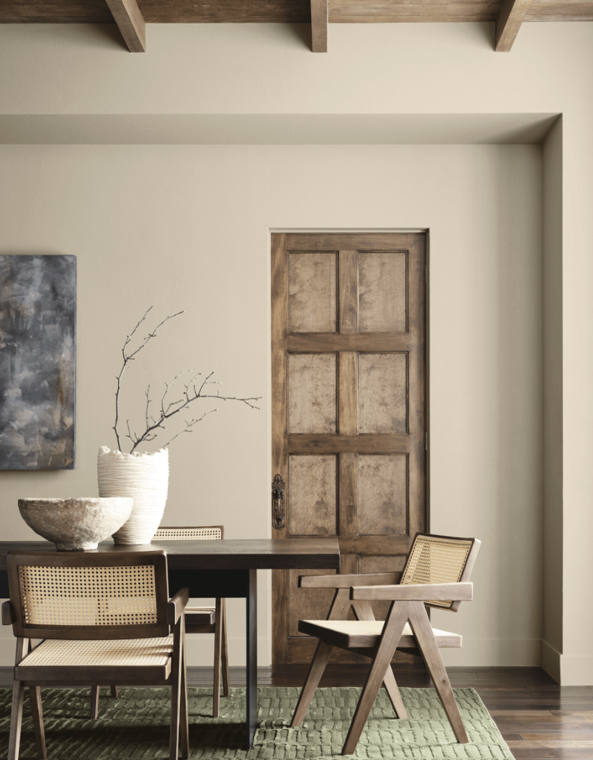
Farrow & Ball: Scallop No. 311 (Trend Color for 2026)
Mood: Sun-warmed shell, gentle optimism, soft warmth
Farrow & Ball does not officially name a single “Color of the Year,” but color experts and interiors media are highlighting Scallop No. 311 as one of the key shades for 2026. It’s described as a warm, shell-inspired pink with browned undertones—soft, sophisticated, and nostalgic rather than sugary.
Psychologically, softly warmed pink-neutrals can:
Promote calm and empathy: Studies and practice in healthcare design have used muted pinks and peach tones to create gentle, comforting environments that reduce perceived aggression and encourage relaxation.
Add warmth without visual chaos: Scallop brings a flattering glow to skin tones, making it ideal for social spaces and bedrooms.
Best uses:
Bedrooms and dressing areas where a flattering, soothing light is desired
Boutique office reception areas or wellness retail where you want a warm welcome
Dining rooms paired with darker woods for a modern, European feel
See the color:
Farrow & Ball Scallop No. 311: Farrow & Ball
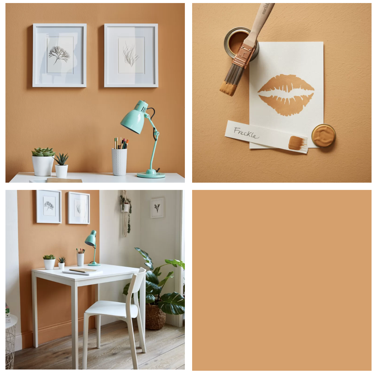
Earthborn’s (UK) Color of the Year
Earthborn: Freckle
Mood: Gentle playfulness, soft earth, relaxed informality
UK-based Earthborn Paints, known for clay-based, eco-conscious formulas, has named Freckle as its 2026 Color of the Year. It’s a soft, earthy neutral with a hint of peach, designed to feel playful yet grounded. Earthborn Paints
In wellness-focused spaces, Freckle can:
Ease transitions: It’s light enough to keep spaces feeling open, but warm and characterful enough to avoid sterility—great for hallways, mudrooms, and multi-use family spaces.
Support emotional ease: Subtle warmth and a hint of color can feel more relaxed and approachable than stark whites, especially for children, older adults, or anyone sensitive to harsh environments.
Best uses:
Family rooms, play spaces, and open-plan areas
Offices and studios where you want a relaxed, non-corporate vibe
Wellness-minded rentals where durability and environmental credentials matter
See the color:
Earthborn 2026 Color of the Year – Freckle: Earthborn

Valspar Color of the Year
Valspar: Warm Eucalyptus 8004-28F
Mood: Nature-first calm, grounded optimism, “new neutral” green
Valspar’s 2026 Color of the Year is Warm Eucalyptus (8004-28F), described as a naturally restorative, cool green with muted depth - a “vintage-inspired, serene” shade meant to relieve stress and encourage slowing down.
Green tones like this are strongly associated with:
Stress reduction and recovery: Studies in healthcare and workplace design repeatedly highlight blues and greens as calming, supportive choices that can lower perceived stress and support emotional regulation.
Biophilic comfort: Warm Eucalyptus echoes foliage and eucalyptus leaves, making it ideal for interiors where you want to blur the line between indoors and outdoors.
Best uses:
Bathrooms and bedrooms as spa-like retreat spaces
Exterior siding or front doors to connect the home to surrounding plantings
Offices or therapy rooms where clients need to feel both supported and alert
See the color:
Valspar 2026 Color of the Year – Warm Eucalyptus: Valspar
Farrow & Ball’s Scallop
Wellness-Driven Color Strategies for 2026
Across all these brands, a clear wellness theme emerges:
Soft whites and neutrals (Cloud Dancer, Epernay, Universal Khaki, Freckle)
Ideal for whole-house envelopes and workplaces where you want clarity and flexibility.
They reduce visual clutter and support focus while still feeling warm.
Grounded greens (Hidden Gem, Midnight Garden, Warm Eucalyptus)
Perfect for spaces designed for restoration and nature connection: bedrooms, bathrooms, therapy spaces, break rooms, and even healthcare environments.
They tap into our biophilic wiring and our innate preference for natural, plantlike surroundings.
Deep, complex hues (Silhouette, Midnight Garden, Scallop)
Best used where you want cocooning rather than stimulation: reading rooms, dens, dining rooms, or focused work areas.
Provide emotional depth and a sense of sanctuary when balanced with good lighting and lighter accents.
For both homes and workplaces, the key wellness questions to ask are:
What do people need to feel in this space? Calm? Focused? Social? Held?
How sensitive are the occupants to light, noise, and visual stimulation?
Where can we introduce nature - through color, materials, or views - to support restoration?
The 2026 Colors of the Year collectively answer with a quiet, resounding message: embrace grounded, nature-linked hues and nuanced neutrals that let people breathe, think clearly, and feel at home in their own spaces.